 "Wheelerguy" (wheelerguy)
05/19/2019 at 06:30 • Filed to: I Went on the Internet, Logos, Logo, Virtua Racing, Virtua Racing Returns, Gamelopnik
 0
0
 2
2|
"Wheelerguy" (wheelerguy)
05/19/2019 at 06:30 • Filed to: I Went on the Internet, Logos, Logo, Virtua Racing, Virtua Racing Returns, Gamelopnik | 0
| 2 |
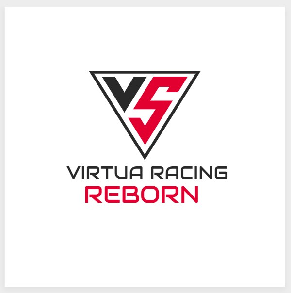
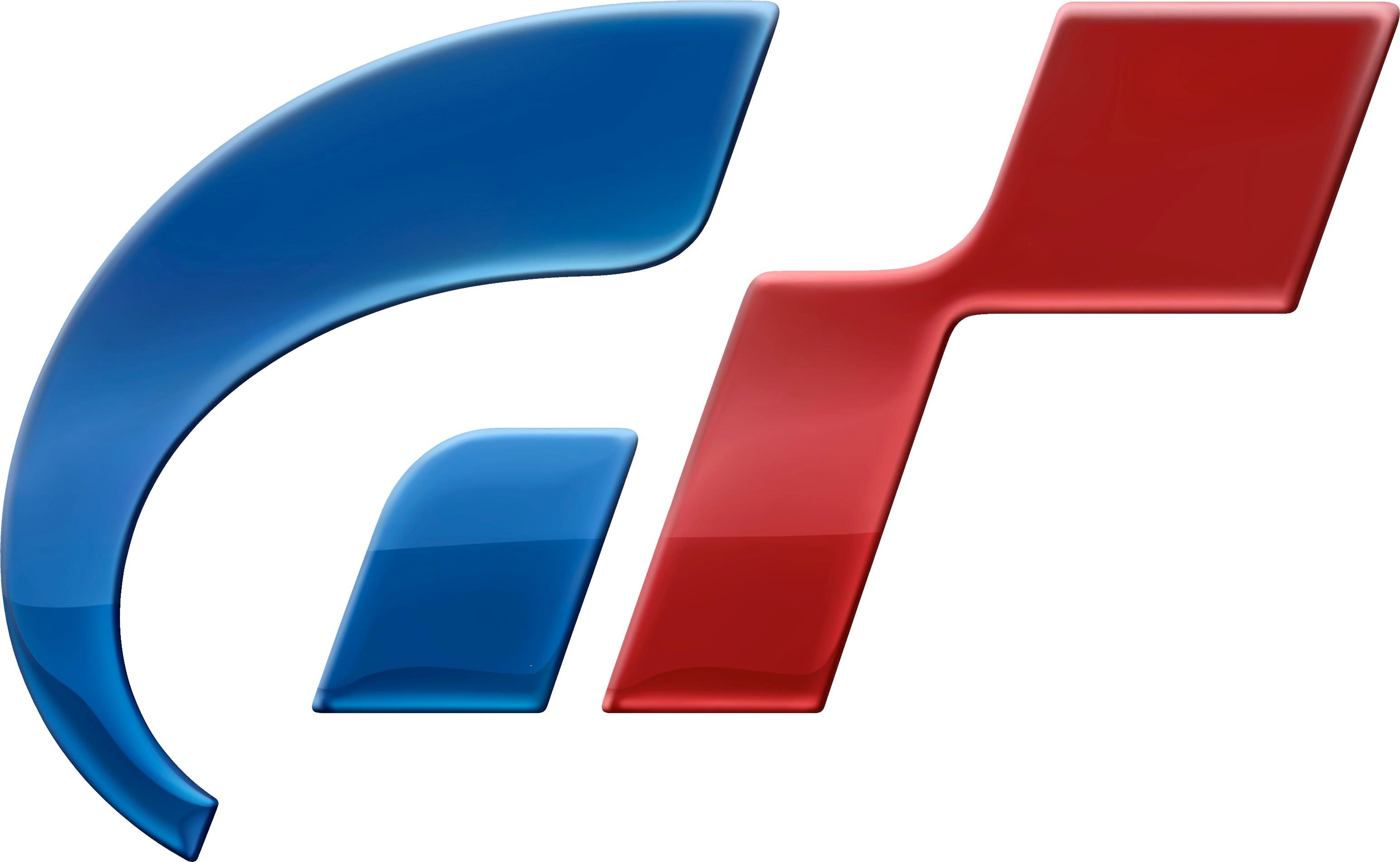
It is a logo. Or at least the basis of one.
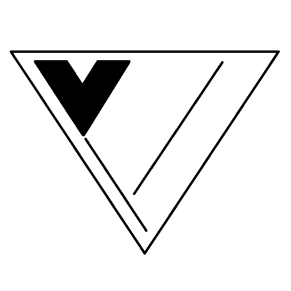
From that I went on Paint and created this draft. I’ve, admittedly, run out of ideas to create the R (middle) and REBORN (right column) text, but I feel like the base design is sound.
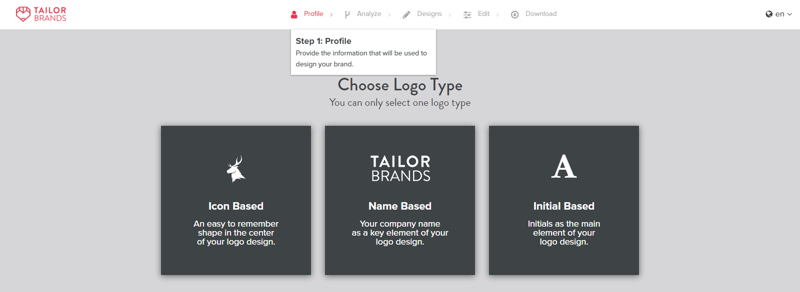
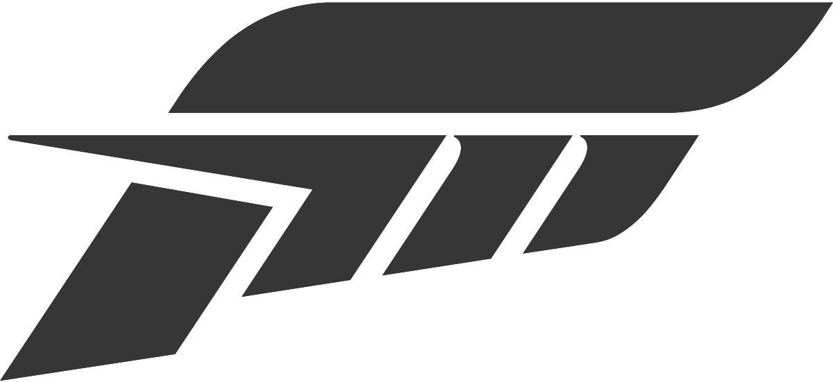
I also went shopping around for other logo makers and ran into this:
Now, you might be thinking: “Wheelerguy, you’re not actually making a game.” True. This is little more than a way to satisfy my curiosity, but Virtua Racing doesn’t really have much of a logotype—
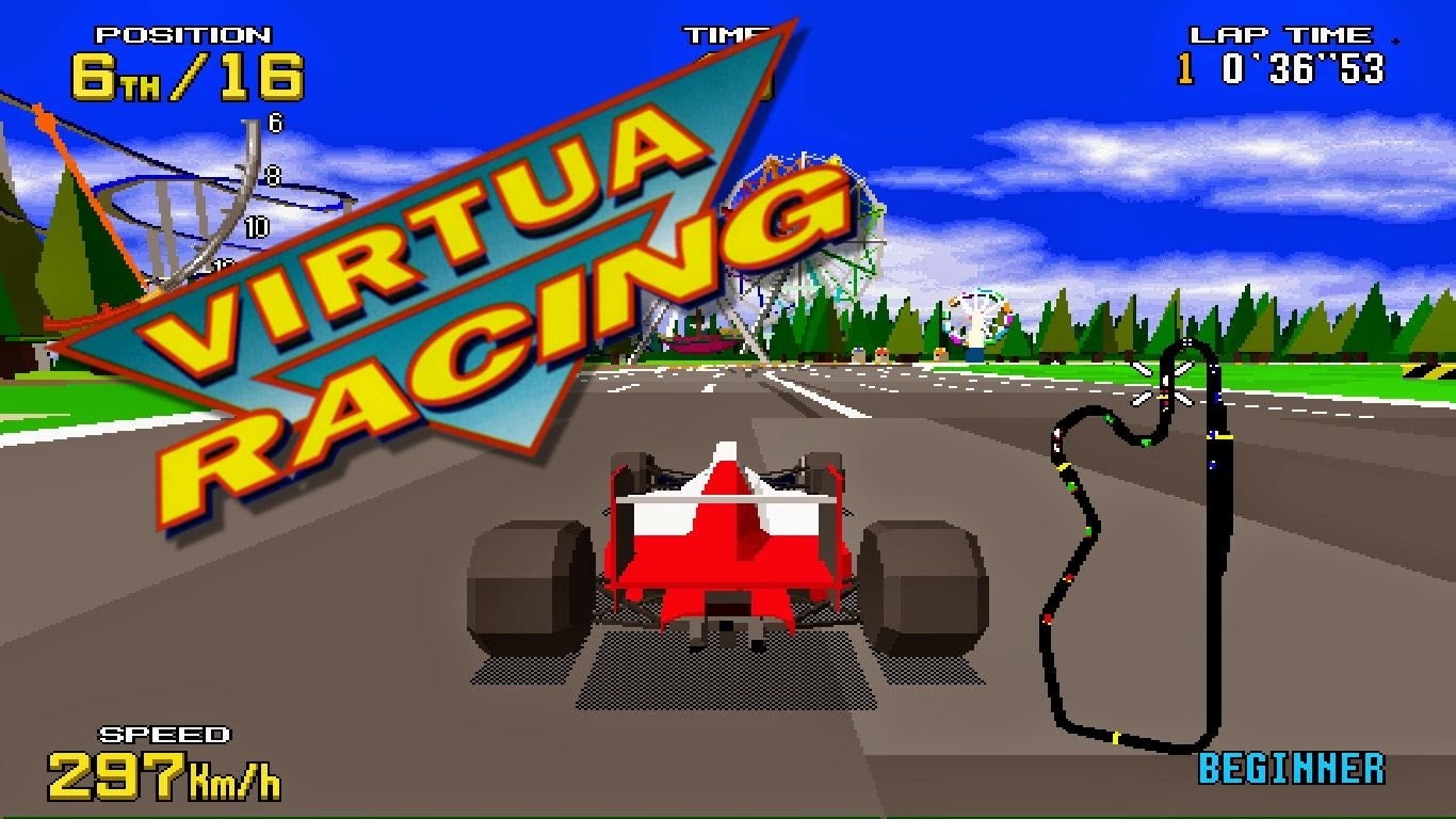
—wait they do but as you can see, it isn’t much.
So the question, then, is this: is a symbol logo good enough? For a game franchise, are symbols a better way to stamp your space?
 Daily Drives a Dragon - One Last Lap
> Wheelerguy
Daily Drives a Dragon - One Last Lap
> Wheelerguy
05/19/2019 at 09:48 |
|
I feel like symbols are a better option for a game because you can sneak them into textures
|
Wheelerguy
> Daily Drives a Dragon - One Last Lap
05/19/2019 at 10:05 |
|
T hat’s what I thought too.
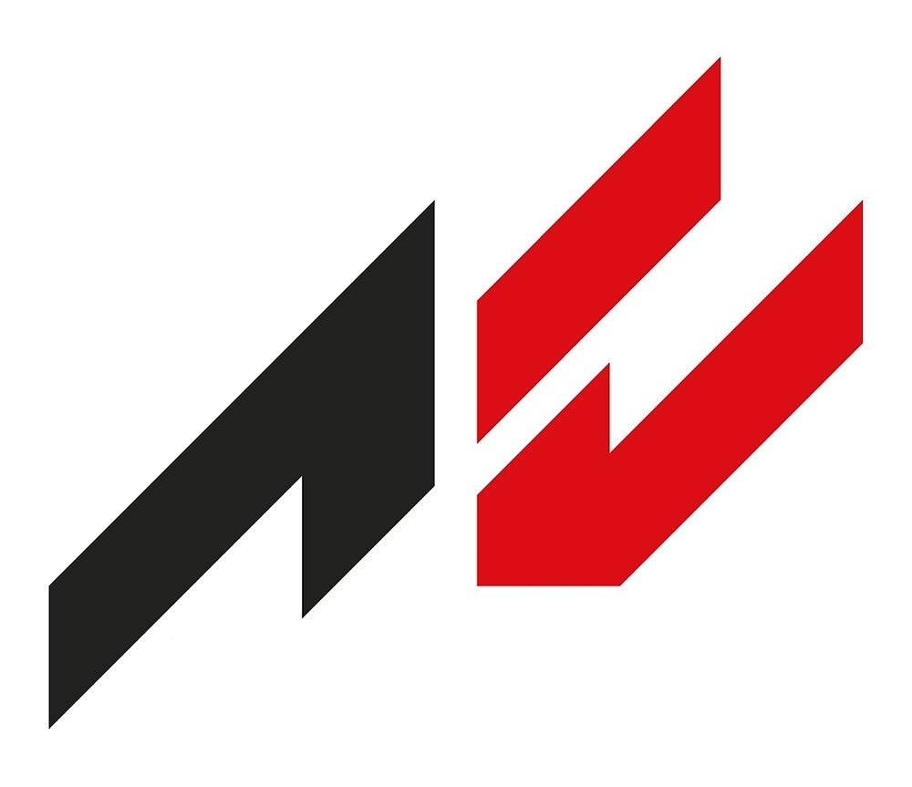
These logos are pretty strong symbols off the bat. I reckon I can get close to that, and then some because the VR type can be textured in as many ways.